
PT
| PT - DE - EN | |
Gótica Rotunda Sforza |
|
|
Uma bela fonte digital da Gótica Rotunda, a fonte dos incunábulos. Esta letra foi digitalizada a partir de uma das mais belas versões da Rotunda caligráfica — aquela usada no Livro de Horas dos Sforza.
|
Muitas belas particularidades do desenho caligráfico foram transportadas com sucesso para esta fonte digital. As versais não existentes no manuscrito - V,W,X,Z - foram adicionadas, a partir de outras versões caligráficas da Rotunda. Na fonte encontram-se muitas das ligaduras caracteristicamente empregues nas versões caligráficas da Gótica Rotunda.
|
|
Compre a Gotica Rotunda Sforza Preço da fonte: 59 Euros — Compra online |
Pode comprar estas fontes via Paypal ou por transferência bancária. Mande um email a Paulo Heitlinger para obter detalhes sobre a conta: pheitlinger(at)gmail(dot)com. |
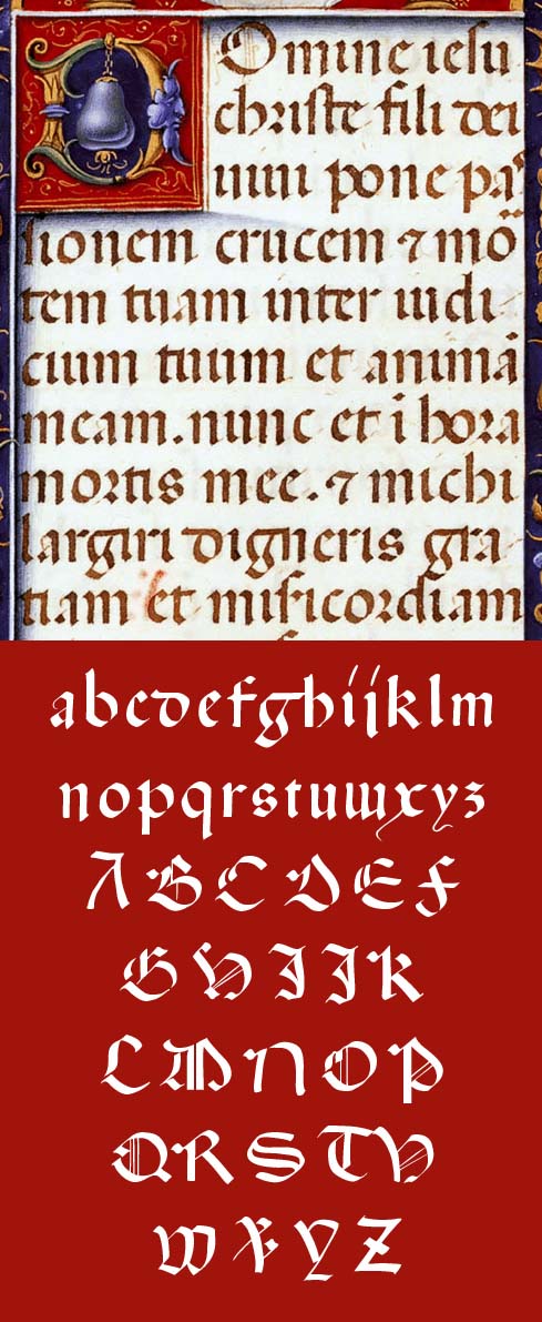
Original (folha do Livro de Horas) e glifos da fonte digital. |
|
As Góticas RotundasUma preciosidade histórica; a letra que acompanhou a impressão dos incunábulos, na Alemanha, Itália, Espanha e Portugal. A fonte Ratdoldt faz parte de um set de três fontes, que incluem a fonte Valentim e a fonte Incunábulo. Todas as três são digitalizações fieis aos padrões históricos. Resultados de uma extensa investigação sobre as letras usadas pelos protipógrafos.
|
|
Informações relacionadasO Livro de Horas digitalizado, na British Library: blpc.bl.uk/onlinegallery/sacredtexts/ttpbooks.html blpc.bl.uk/onlinegallery/sacredtexts/sforza.html Valentim Fernandes, prototipógrafo morávo, activo em Lisboa. Erhard Ratdolt, prototipógrafo alemão, activo em Veneza e Augsburgo. |
|