
Jean Jannon (Suíça,1580-1658)
O autor dos Caractères de l’Université
Um século depois da morte do ilustre gravador de punções parisiense Garamond (que faleceu em 1561), a maioria dos impressores europeus possuía as suas romanas – ou algo bastante parecido, porque a partir de 1640, foram os caracteres do suíço Jean Jannon que entraram em voga.
Algumas letras ditas "Garamond" de hoje derivam de Jean Jannon, que foi o autor dos célebres Caractères de l'Université, muito tempo erroneamente atribuídos a Garamond. O facto de estes Caractères de l’Université terem sido atribuídos a Garamond originou uma enorme confusão.
Foi o mérito da perita e historiadora britânica Béatrice Warde ter descoberto que os tais Caractères de l’Université em posse da Imprimerie Royale (depois Nationale) foram na realidade obra do impressor Jean Jannon, que executou essa obra-prima tipográfica inspirando-se nas letras de Garamond – mas mais de 40 anos depois da morte do mestre. Estas letras, com a designação Typi Academiæ (Caractères de l'Université), foram gravadas em Sedan por volta de 1621. þ
Frantisek Storm sobre Janon
"The engraver Jean Jannon ranks among the significant representatives of French typography of the first half of the 17th century. He was born in 1580, apparently in Switzerland. He trained as punch-cutter in Paris. From 1610 he worked in the printing office of the Calvinist Academy in Sedan, where he was awarded the title "Imprimeur de son Excellence et de l'Academie Sédanoise".
He began working on his own alphabet in 1615, so that he would not have to order type for his printing office from Paris, Holland and Germany, which at that time was rather difficult. The other reason was that not only the existing type faces, but also the respective punches were rapidly wearing out. Their restoration was extremely painstaking, not to mention the fact that the result would have been just a poor shadow of the original elegance.
Thus a new type face came into existence, standing on a traditional basis, but with a life-giving sparkle from its creator. In 1621 Jannon published a Roman typeface and italics, derived from the shapes of Garamond's typefaces.
As late as the start of the 20th century Jannon's type face was mistakenly called Garamond, because it looked like that type face at first sight. Jannon's Early Baroque Roman type face, however, differs from Garamond in contrast and in having grander forms. Jannon's italics rank among the most successful italics of all time - they are brilliantly cut and elegant."
 |
|
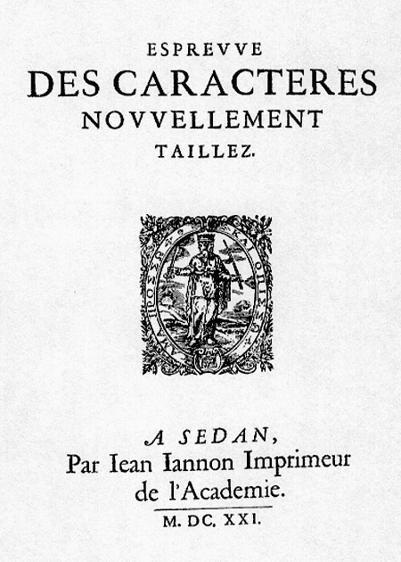
«Prova de caracteres, novamente gravados » por Jean Jannon, mostruário impresso na cidade de Sedan em 1621. |
Quer usar este texto em qualquer trabalho jornalístico, universitário ou científico? Escreva um email a Paulo Heitlinger.